
Responsive Design
Viewport Units Script
Responsive Viewport Units
WordPress Plugin with JavaScript Source Code
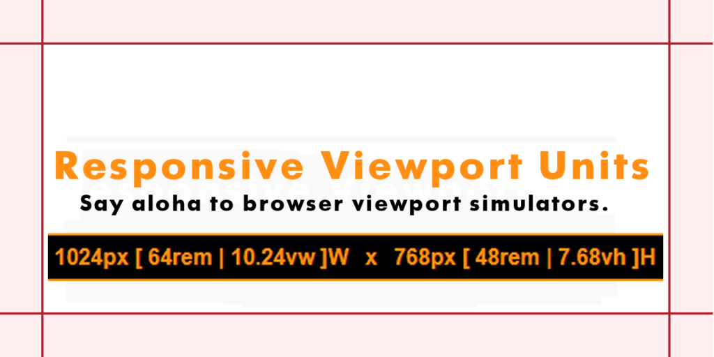
Responsive ViewPort Units generates and displays a browser’s viewport unit values at the bottom of the page displayed within a browser’s viewport each time a page is loaded and regenerates the unit values each time the browser is resized horizontally or vertically.About This Code
Responsive ViewPort Units was written using Classic “Vanilla” JavaScript in 2017; exceptions noted as follows. The distro was developed as a WordPress plugin and can be installed as such. If wanted the script can be copied from the distro or by viewing source when installed and run on a WordPress site where the source code can be copied by viewing source and pasted into a <script> block in any HTML file by anybody with an interest in doing so. The JavaScript source code is commented reasonably well and settings can be modified in WordPress or manually by touching the copied and pasted JavaScript itself as may be wanted or needed by those who have difficulty with the default black and gold color scheme. Similarly, the source code has been written to change the font size and text color to white on a black background when the browser is resized to a very small horizontal width so as to avoid brower chrome from obfuscating the generated output that is hard-coded to not wrap. A 3rd party jQuery color picker was selected for use in WordPress Settings where color and positioning of the output can be configured. WordPress has been deprecating the use of jQuery but that will not prevent the code from being installed and generating output however WordPress configuration settings may no longer function and those who use this code will have to settle for the color and positioning defaults; gold on black and white on black as shown above or further explained herein.Dependencies
- jQuery **may** be required for WordPress settings as noted.
- JavaScript **must** be enabled in the browser.
- Browsers **must** enable localStorage and cookies.